Myth: Odds ratios and relative risk and hazard ratios are used interchangeably when discussing studies, and sometimes even in their reporting.
Malady: We explore these three different measures in terms of computation, interpretation, cases you cannot use them, and how they’re laced with traps for young players.
When I find myself in times of trouble, statistics comes to me. Actually, I think it’s the other way round, I think it’s the statistics that gets me in trouble. An easy opening line aside, this is a topic that I have a Potter-Voldemort relationship with – neither one can live while the other survives. In fact, my lack of aptitude for mathematics turned me away from a lifetime of stargazing and physics towards what I thought would be a calm alcove of medicine and biology. Thwarted again. Like it or not – and the answer is definitely not – mathematics is the universal language of science, and part and parcel of being an evidence-based junkie is an unhealthy reliance on statistics.
A topic that confuses me, and seemingly many others even in published literature, is the difference between relative risk, odds ratios and hazard ratios. When is it appropriate to use what, and what’s the difference anyway? And most importantly, how do you interpret these and their caveats.
Let’s take a walk through the example park.
Say we have a 100 strong cohort of medical graduates and we are interested to see whether their exposure to Myths and Maladies influences their statistical literacy, and we follow these graduates over their first two years of work. Because of marketing limitations, and an unwillingness to branch out more readily to alternative forms of multimedia, only a limited number of them are exposed to M&M – in this example, an optimistic 30%.
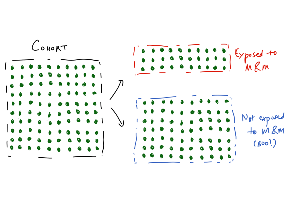
At the end of this study period, we are curious to see how many remain statistically illiterate when practising – and more importantly, if reading M&M religiously played a role in that. Here, we turn to the following tried and tested measures:
Relative Risk
Risk is perhaps the most intuitive of them all, it is the probability of an outcome. Classically, it applies to a population-level epidemiological (silence the groans), cohort or intervention study types. We are interested in the exposure’s (or intervention’s) role in the development of the outcome – often a disease or side-effect.
To calculate this, we look at the risk of developing the usually binary outcomes – in this case, a negative outcome of statistical illiteracy (treated as the primary event for simplicity) and a positive outcome of statistical literacy – stratified by whether they are exposed to the factor of interest (M&M readership). This is expressed in the form of every public health person’s bedside photo, a 2×2 contingency table.

Relative risk is the experimental event rate divided by the control event rate. RR is interpreted simply, if it’s <1 you are at lower risk (presumably correlated with the exposure) and if it is >1, it suggests the exposure is correlated with an increased risk of the outcome. Remember, we are measuring correlations here – these observational studies do not establish causation.
The benefit of a risk calculation is that it helps you identify these other metrics, that are quite intuitive (especially for a layperson) and provides a better understanding of the probabilistic nature of interventions.
Absolute Risk Reduction
Difference between control and experimental event rate.
Simples, right? The best part of the ARR is that it helps you calculate the number needed to harm (for cases with increased risk) and the number needed to treat (for intervention trials). This is a big melting pot for evidence-based medicine, because it really distills down what the strength of an intervention is. The consequence is that it also shows how ineffective most interventions are – if you asked a layperson how many people should have to take a statin to reduce their risk of a heart attack for it to be an acceptable medication, you’d expect an answer in the single digits. In contrast, the true NNT for individuals where statins are used as primary prevention is closer to 100s.
Relative Risk Reduction
Difference between control and experimental event rate, divided by the control event rate.
This can be quite misleading in cases of low outcome prevalence, where the delta between the relative and absolute risk is quite dramatic. This is also where clickbaity news headlines are born, where chomping on 3 grapes instead of 2 every night reduces the risk of coronary artery disease by 75%, where the absolute risk reduction may be a whopping 0.0015%.
Odds Ratios
Odds are different to risk, even if it sounds like it just ain’t so. Odds are comparisons of the relationships and symmetries between two variables. The computation is similar to that of relative risk, but you rely on the ratios of the two variables in opposition rather than worrying about the total sample size. Somehow, this actually does make a difference, as you can see from using the same contingency table.

If the outcome of interest is infrequent – the rarer it gets, the closer the odds ratio approaches the relative risk. In high frequency outcomes like the example above, the OR can be quite dramatically larger (or smaller) than the RR – which is important to keep in mind when interpreting these. You can also do a log of the odds ratio, which cognitively helps to minimise the dissonance we experience when we cannot realise the magnitude of change is the same with an OR of 0.1 and an OR of 10.
So if we already have a similar metric of RR, why bother with OR? A key use case is case-control studies which are retrospective analyses where we sample a group with a disease or outcome of interest, and match them to a control group. Here, we try and work backwards to see if the exposure we are investigating has any relevance to the outcome. Unless you have a lot of time and endless grant funding on your hands, this is generally how many epidemiological studies are completed – imperfectly though they may be compared to prospective cohort studies. Odds also become important for regression analyses, beyond the scope of this article and your attention span.

As you can see it doesn’t really make sense to calculate a relative risk from this example because we assume the incidence of the exposure is the same as the ratio of cases and controls we have recruited for our study. Essentially, odds do not translate to probabilities – that is closer to risk.
A Word of Warning
Now if you have made it this far – I extend my congratulations to your perseverance with my poorly illustrated schematics. The rest of this is now going to get exponentially harder, and more to do with the realm of clinical trials where the reign of Hazard Ratios is supreme. This may as well be forbidden knowledge, it’s somewhat unintuitive, and a huge pain to understand (as it was for me to try and learn) and you’ll probably forget how to interpret this.
Venture past this point at your own risk, and save me the hate mail for if the explanation does not do much to illuminate these murky waters.
Hazard Ratios
This is classically reported in studies that do survival analyses, and sounds temptingly similar to a risk or an odds. In fact, the hazard ratio is quite different, less immediately intuitive and when written out: it corresponds to the probability of developing the primary outcome at a time-point, given the participant has made it this far. Now this sounds a bit Squid Game-y, but it is an estimate of the likelihood of survival at any point during the study period in the intervention group, compared to the controls. This is oncological bread and butter.
As you can imagine, this also means you need longitudinal time-to-event data (i.e. you need to know when they attained the outcome, not just whether they have or not). It also is the worst pain of all of the above to calculate, and there are a few methods, most commonly the Cox proportional hazards method, to arrive at the hazard ratio. Put simply, it is a calculation that relies on the gradient of change in each group (commonly visualised in a Kaplan-Meier curve as below) to derive a comparison of how fast the event is happening in each group. It is a measure of rate, much different to the ratios we discussed earlier, since it relies on the unit of time.
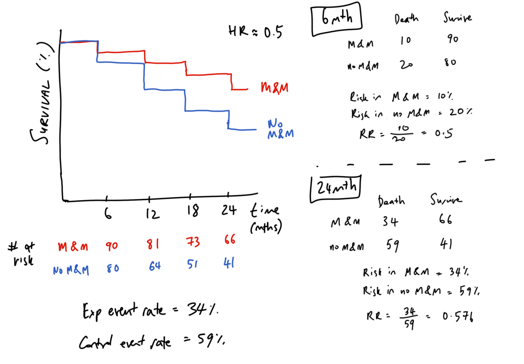
The best way I have come across interpreting hazard ratios is to think about it like compound interest. To simplify hazard ratios, let’s take an example whereby we treat being yelled at by a statistician as equivalent to death, and plot survival curves for those who read M&M and those who deny its wisdom.
In those who do not read M&M, the hazard (chance of being yelled at by a statistician at every 6 month interval) is 20%, compared to 10% for M&M readers – and this is simply a hazard ratio of 0.5. So if we take a balanced population of 100 individuals in either group, we get a Kaplan-Meier curve like below. Note that the number of risk does not decrease by 10 each time, but by the 10 or 20% of the remaining number still alive (number at risk).
Effectively, this comes out to M&M being represented as 0.9#6mthly intervals and no M&M being represented as 0.8#6mthly intervals. Compound interest! You can see that if we do a cross-section (aka relative risk) at the 6 month timepoint, the RR equals the HR – this first time point is the only time that this can hold true. As we follow up our cohort longer, the RR and HR diverge – the HR remains the same, but the relative risk (and the odds) changes overtime. Effectively, this means that a HR of 0.5 does not mean a “50% lower risk of death” as it is often incorrectly reported.
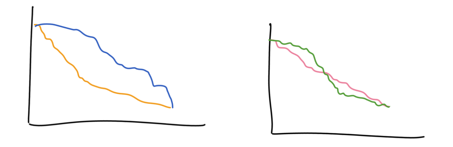
Hazards are helpful to understand the progression of these outcomes with relation to time, leading up to the primary endpoint. In contrast, odds ratios and relative risk are more opaque to how time is a factor in how we arrive to the endpoint. For example, these curves below would have different hazard ratios but the same odds and relative risk by the end. These curves also violate the ‘proportional hazards’ assumption which is that the ratio of events happening in each group is the same throughout the whole study, which makes computing the hazards ratio a bit tricky.

It’s also incorrect to think that a hazard ratio of 2 means that the control group is progressing at twice the speed – it instead means that they have twice the chance of progressing at each interval compared to the intervention group.
Trivia
A neat, perhaps obvious, fact I learnt along the way is that K-M curves are to do with percentages in each step – so in the latter half of the study, the big steps you see may only be a small handful of patients in the study but it looks dramatic because that’s a big chunk of the remaining population. The lower the study’s survival goes, the less reliable these curves become.
Giants’ Shoulders:
Recommended reading on all of the above – Wikipedia has fantastic statistics pages
Hazard Ratios – Sashegyi & Ferry and Dumas & Stensrud
NNT Sass about Statins
AMBOSS Medical Stats videos
Relavant Australian Prescriber article about these ratios
Discover more from Myths & Maladies
Subscribe to get the latest posts sent to your email.

1 Comment
Comments are closed.